![]()

![]()
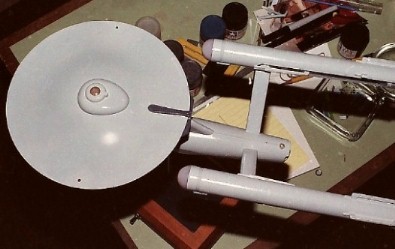
 With the model assembled, it was prepped for painting. The model is covered with a series of small raised rectangular and circular outlines representing windows. They're all a little oversize and most are in the wrong positions so they were all sanded off. Correct windows would be applied as decals after painting. All illuminated domes and pre-painted areas like the copper sensor dish and sensor platform were masked off with masking tape and Parafilm "M" laboratory film (Fine Scale Modeler, Feb. 1993). The model was then sprayed with automotive primer.
Before spraying on the main color, some parts like the impulse engines
and the rear warp engine caps were masked off. These would remain the
dark
gray of the primer coat.
Colors from Tamiya's line of acrylic hobby paints were used. With a
full three-quarter-ounce (23ml) jar of gloss white as a starting point,
I mixed in the other
colors little by little until I got something that I thought looked
like
the light gray color of the big model, kinda-sorta keeping track
of what I
used. Measurements below are all approximate:
The above list clearly shows that the process of matching the color had gotten away from me. By the time I finished mixing, it looked like I had enough paint to cover the 11-foot studio model. And, yes, I was serious about those 4 drops of Metallic Gray. Still, I thought it was a good match for color in my photos and decided to go with it.
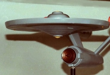
The entire batch of the color mix was thinned for spraying with straight-up denatured alcohol. (Yeah, I know better, now.) Using a Badger 350 mini spray gun, the model was given three heavy coats over the course of two hours, using a hair dryer to try to speed up the drying time. (Again.) This Enterprise was a uniform shade of gray and remained un-weathered, just as I'd seen it in the Smithsonian. I was pretty satisfied that I got the color right. The paint looked very close to the color of the big model in my photos. Tamiya Clear was then sprayed on to prep for decals. |
 |
 |
|
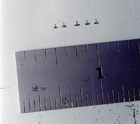
| Some markings, such as the triangles on the saucer bottom and the mysterious, not-seen-on-TV shapes on the secondary hull bottom were airbrushed onto clear decal film before being applied to the model to help avoid positioning problems. Little numbers on the side of the hull were made from 1/4" dry transfers reduced to 1/32" on a copy machine directly onto decal film (this was 1991, long before I would be in posession of a personal computer). New engine pylon grids were made by making an oversize master with Letraset diamond grid screen, reducing it down and copying that onto decal film. |
 |
|
When building the model, some grooves were filled in on the backs of
the
warp propulsion units and on the hangar deck. They were
replaced
with 1/64" dry-transfer stripes on decal film.
I made window decals by burnishing sections of Woodland Scenics white and black dry-transfer striping (1/32") onto decal film and applied that to the model for windows with sharp edges and corners. I used photos of the TV model and drawings in SHIPS of the STAR FLEET as a placement guide. The left side of the Enterprise studio model is devoid of any details and markings. This is where the wiring for the lights entered the model so it was filmed from the right side only. This allowed me to use some imagination (gasp!) for the window placement on the left side of my model. To save time and effort, I clear-coated the model and decals with Krylon Crystal Clear and finally Krylon Matte Finish out of spray cans. I could have used Tamiya Clear which was the same brand as the colors used on the model but that would have required me to set up my airbrush and compressor. Again, I should have known better but I thought I could get away with it. (Why not? Tamiya and Krylon both say "acrylic" on their labels!) I learned something that day. |

|
|
|
|
|
|
|
|
|
|
|
|
![]()

![]()
![]()


![]()
![]()